Advocate Health interim brand guidelines
Our brand represents who we are and what we stand for. It’s a reflection of both how we as teammates think about ourselves and what everyone who interacts with us thinks and feels about us. Our brand is the feeling people have when they speak with us, view our communications or make an appointment. It’s the culmination of countless interactions coming together to create an opinion. Because of this, it’s vital that our brand guidelines are followed.
The brand is still evolving. These guidelines are interim and will continue to be updated.
Enterprise brand identity


The Advocate Health logo represents the ever-evolving world of health and wellness. While the name and outer cross were pulled directly from the existing Advocate Health Care legacy brand, the font and inner cross were redesigned specifically to represent the fonts and shape of both Atrium Health’s tree of life and Aurora Health Care’s infinity symbol. The upward movement of the inner shape signals a healthier tomorrow for our patients, communities and teammates.
Interim brand colors
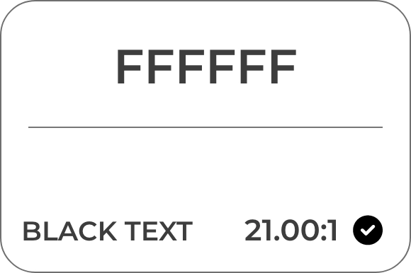
A full color exploration is underway. For now, the following colors are approved to represent the brand.


Care delivery brands & academic core identities
Our care delivery brands and academic core all have strong equity within their respective markets. We will continue to use these names and logos for site signage, market-specific advertising, marketing, communications, partnerships and in relation to most of our teammates. If there’s a need to include multiple logos in conjunction with the health system/enterprise brand, the care delivery brands should always be listed in alphabetical order.
The care delivery brands and academic core below are not an exhaustive list within the respective states. There are additional logos for the regions, markets and institute service lines. And these too will utilize a linkage strategy to connect to the enterprise brand.
Care delivery brands


Service line/institutes


Academic core


Do not attempt to recreate any of these logos. If you need access to any of these logos, please contact brandmailbox@aah.org or brand@atriumhealth.org.
Brand architecture
Enterprise brand usage
The enterprise brand logo will appear on/in:
- Materials during national presentations (e.g., financial markets, payers, conferences, professional stakeholders)
- National earned media references
- Corporate headquarters office signage
- Titles, email signatures and business materials for executive health system leaders
- Internal communications related to enterprise-wide news
- School of Medicine not included at this time
At this time, the enterprise brand logo should not appear on/in:
- Top-of-house signage for care delivery or academic core locations
- Internal communications related to market or regional news
- Onsite teammate apparel (e.g., uniforms and scrubs)
- Regional-, market- and site-based partnerships
Care delivery brands
When speaking about a site, news, event or program specifically linked to a state or region, use the appropriate care delivery logo.
For example:
- The Advocate Health Care logo is used when addressing sites in Illinois.
- The Atrium Health logo is used when addressing sites in North Carolina, South Carolina, Georgia or Alabama.
- Use Atrium Health as the consumer-facing brand in the Southeast to represent the greater Charlotte market or anytime more than one market in this area is represented.
- The Aurora Health Care logo is used when addressing sites in Wisconsin.
Brand Linkage
Early integration efforts included direction to use the linkage line, “Now part of Advocate Health” to help increase consumer awareness. As the combination moves forward and brand strategy is solidified, the linkage line is no longer needed in most cases.
For additional guidance, contact the brand team at brand@atriumhealth.org or brandmailbox@aah.org.
System-wide graphic
The logo with all four care delivery brands is reserved for Enterprise Leadership and select recruitment communications.
For additional questions, contact the brand team at brand@atriumhealth.org or brandmailbox@aah.org.


Use of linkage with the Midwest Region LiveWell platform
The LiveWell platform (the Midwest Region’s patient health and wellness portal) will maintain its current logo for the time being. More information to come as the enterprise brand strategy is solidified.
Glossary of terms
As we create our unified culture, the words we use matter. We are examining words used across our legacy organizations to align on common language. Below you will find the initial entries in our Advocate Health glossary. We will continue to seek input and expand our new glossary in the days ahead.
- Teammates – Health care is a team sport and together we go further. Moving forward, our 155,000 employees will be referred to as teammates to reflect the important role everyone plays in caring for our patients, communities and each other.
- Enterprise – We will refer to Advocate Health as the enterprise.
- Region – Advocate Health is comprised of two regions, the Midwest and the Southeast.
- Market – A market refers to designated groupings of acute and ambulatory sites within a geographic zone within a region, such as the Greater Charlotte Market (Southeast Region) or the Illinois Market (Midwest Region).
- Area – An area is defined as designated groupings of acute and ambulatory sites within a targeted geographic zone within a market, such as the South Area within the Greater Charlotte Market or the Greater Milwaukee Area within the Wisconsin Market.
- Site – A site refers to a specific location or campus within an area, such as Atrium Health Pineville or Aurora St. Luke’s Medical Center.
- Consumer First – Putting the consumer first means anticipating people’s needs and exceeding their expectations. By creating easy, personalized health and wellness experiences, we’ll seamlessly connect and simplify the consumer journey. This will be a top priority for Advocate Health.

